Introduction to Framer: Layout and CSS Panel Properties
Framer is an all-in-one design and prototyping tool that empowers designers and developers to create interactive designs and prototypes seamlessly. Whether you are a beginner or an experienced professional, understanding the layout and CSS panel properties in Framer is essential to fully leverage its capabilities. This blog will guide you through the basics of the layout and CSS panel properties in Framer.
1. Layout in Framer
The layout in Framer is designed to be intuitive and flexible, allowing you to create responsive and adaptive designs easily. Here are the key components:
a. Frames
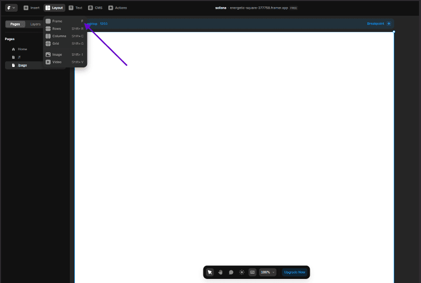
Frames are the building blocks of your design in Framer. They are similar to divs in HTML and can contain other elements like text, images, and components. You can create frames by simply drawing them on the canvas or by using the Insert menu.
b. Stacks
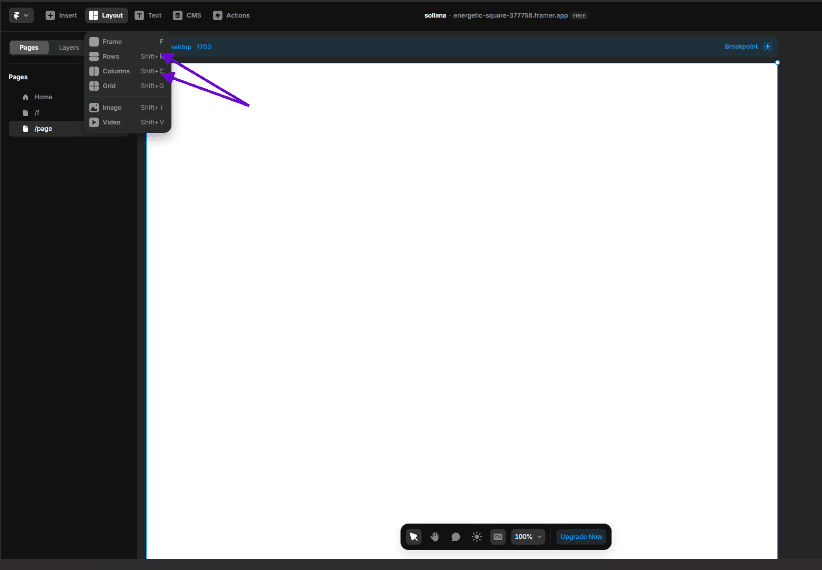
Stacks help you organize elements vertically or horizontally. They automatically distribute space between elements and align them. You can adjust the spacing, padding, and alignment properties of stacks to create clean and organized layouts.
c. Grid
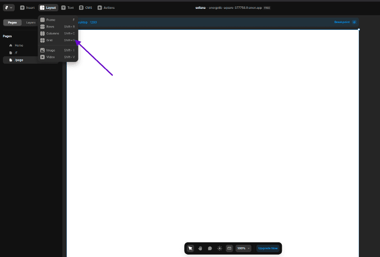
The grid layout provides a structured way to arrange elements in rows and columns. While you might not use grid layouts frequently, they are useful for creating complex and highly structured designs.
2. CSS Panel Properties
The CSS panel in Framer allows you to style your elements with precision. Here’s a quick overview of the most important properties:
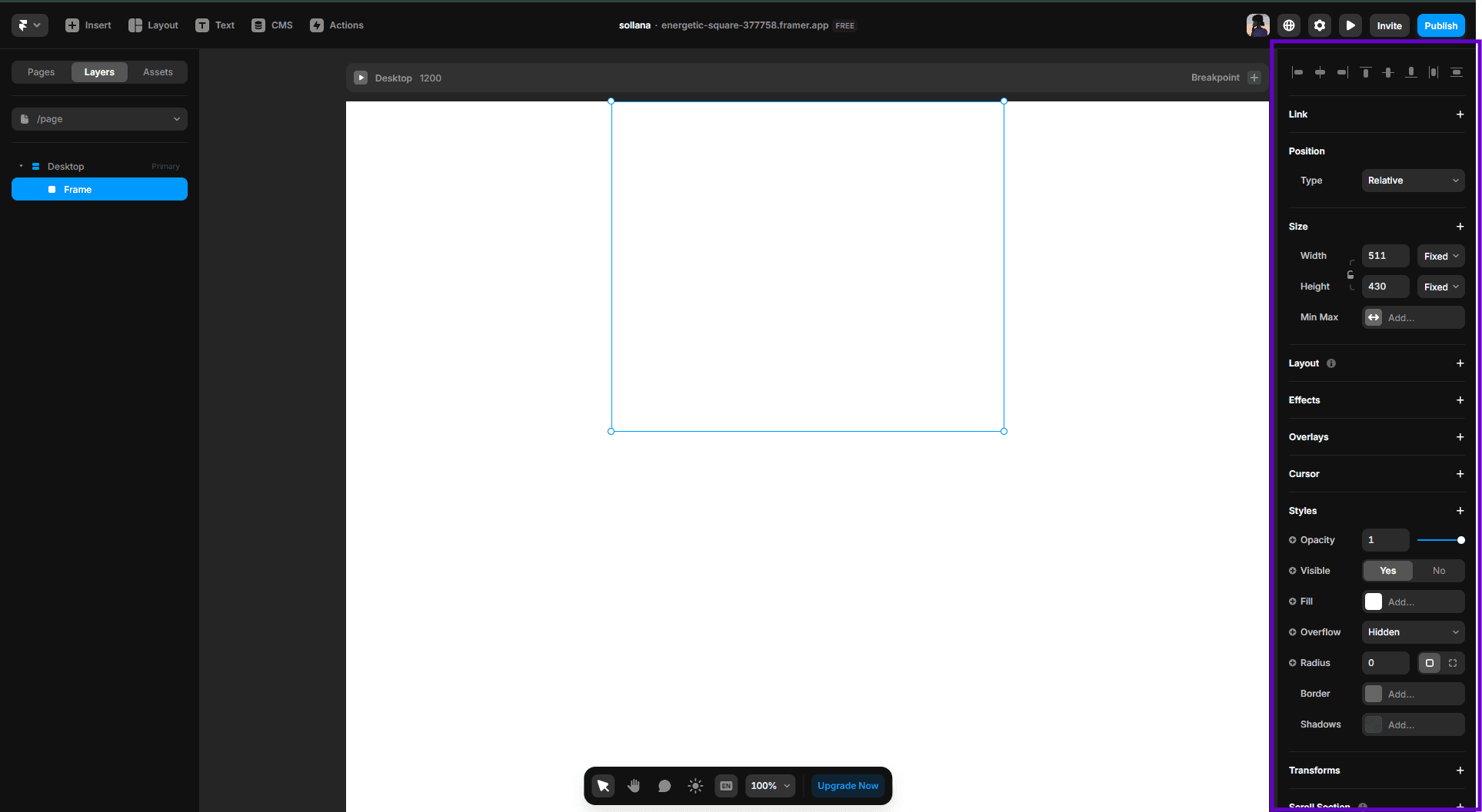
a. Positioning
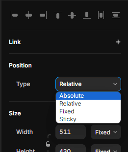
Position: Define whether an element is positioned statically, relatively, absolutely, or fixed.
Top, Right, Bottom, Left: Control the offset of the element from the respective edge of its containing block.
b. Dimensions
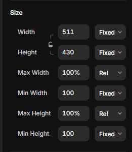
Width and Height: Set the dimensions of an element. You can use fixed values, percentages, or auto.
Max Width and Max Height: Define the maximum dimensions an element can have.
Min Width and Min Height: Define the minimum dimensions an element can have.
c. Padding

Padding: Add space inside the element, between the content and the border.
d. Typography
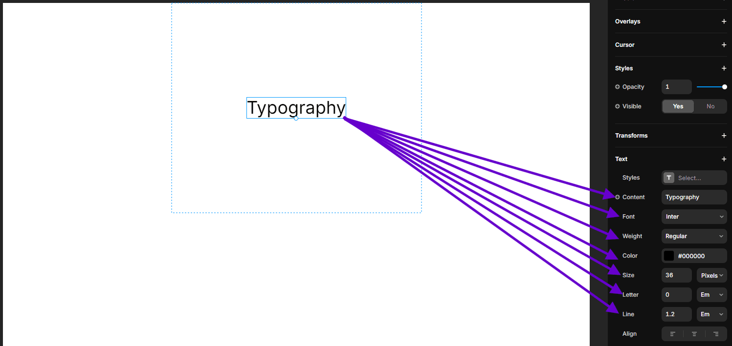
Font Family: Choose the font for your text.
Font Size: Set the size of the text.
Font Weight: Define the thickness of the text.
Line Height: Control the vertical spacing between lines of text.
Letter Spacing: Adjust the horizontal spacing between characters.
e. Background
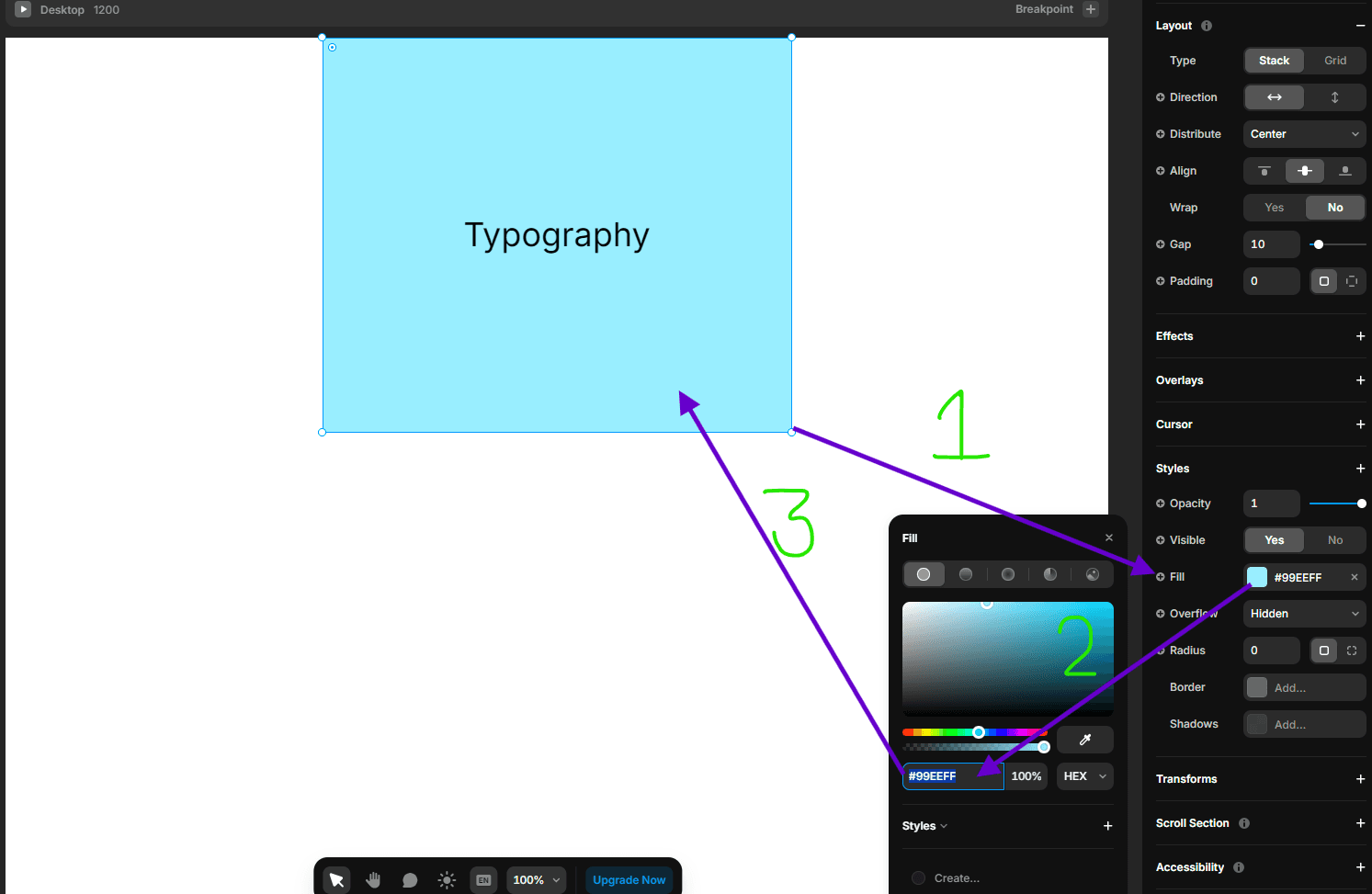
Background Color: Set the background color of an element.
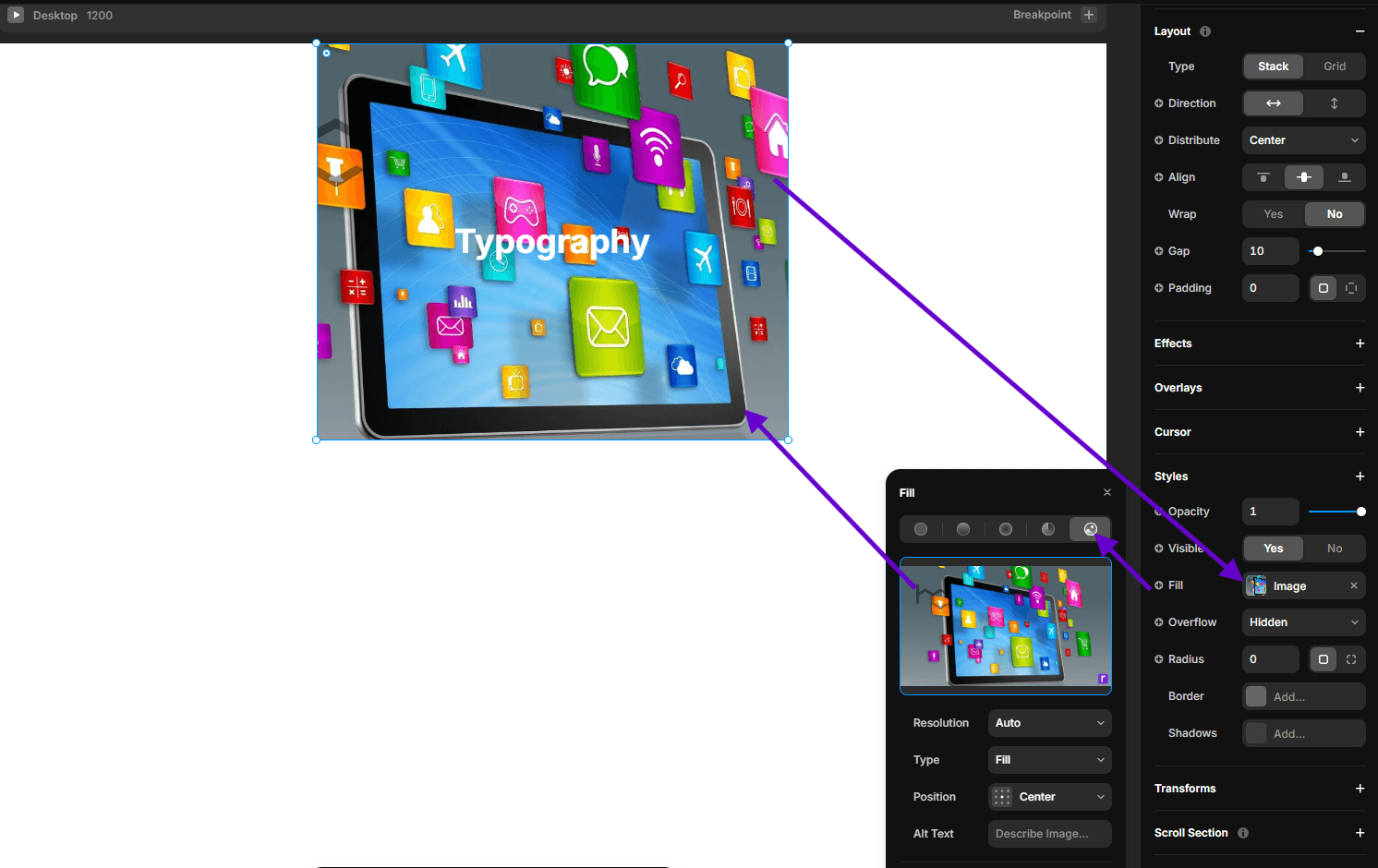
Background Image: Add an image as the background.
f. Border
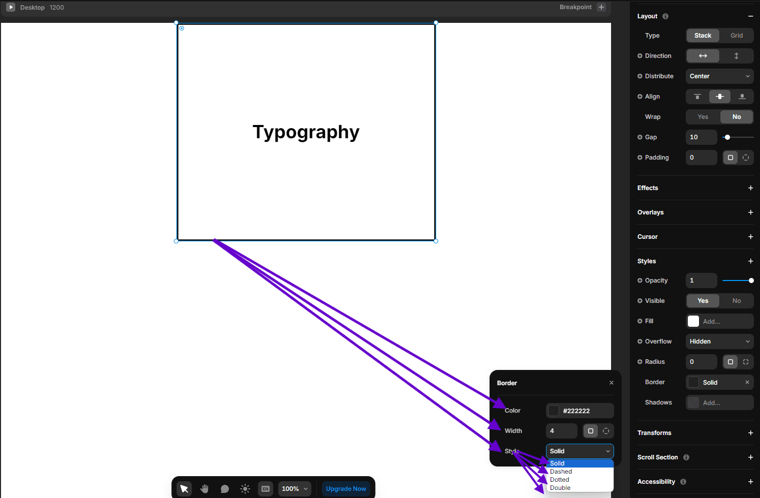
Border Width: Set the thickness of the border.
Border Style: Define the style of the border (solid, dashed, dotted, etc.).
Border Color: Choose the color of the border.
Border Radius: Round the corners of the element.
g. Shadows
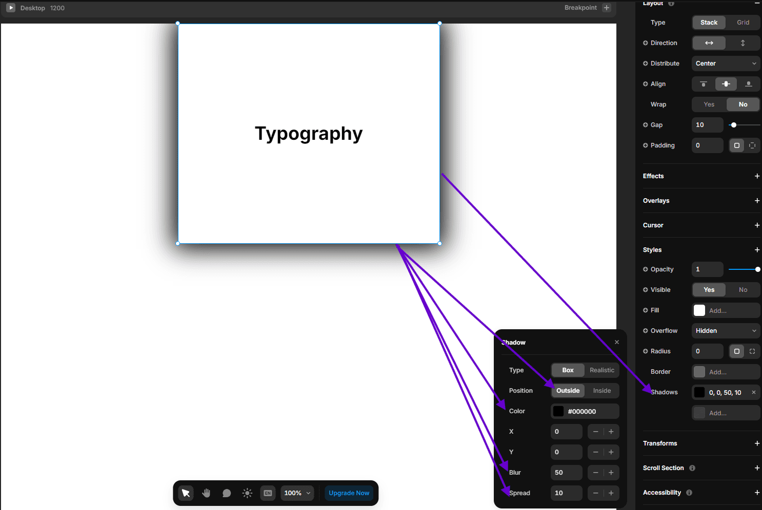
Box Shadow: Add shadow effects around an element. You can control the offset, blur, spread, and color of the shadow.

Text Shadow: Apply shadow effects to text. Similar to box shadow, you can control the offset, blur, and color.
h. Opacity and Blend Modes

Opacity: Set the transparency level of an element.

Blend Mode: Define how an element’s content should blend with the content of the element’s background.
Conclusion
Understanding the layout and CSS panel properties in Framer is crucial for creating stunning designs and prototypes. By mastering frames, stacks, and grids, along with the various styling options available in the CSS panel, you can bring your design ideas to life with ease and precision. Happy designing with Framer!